This is a a collection of links and thoughts about web design which tries to give some guidelines. It is in no way meant to be complete.
First, consider web page layout
- Which part of the web page is visible? (scroll?)
- What viewport size(s)? Try aiming at least: Small (under 600px), Medium (600px – 900px) and Large (900px+)
- Will it be scale-able, fixed or responsive?
Articles:
Do: Test your site on your mobile, on other computers, at home etc.
What’s good? … and what’s not?
 Content is king! [readable, clear, to-the-point]
- Texts: quick-scan & in-depth [texts should be very short, but if necessary, provide more info]
- Navigation [easy to navigate, can we find what we want… and expect?]
- Graphics & colors
- Technical aspects: valid HTML, multiple browsers… (test!)
Articles:
- About.com: Webdesign basics
- Learn good web design by looking at bad web design: webpagesthatsuck.com (this is becoming old)
Composition
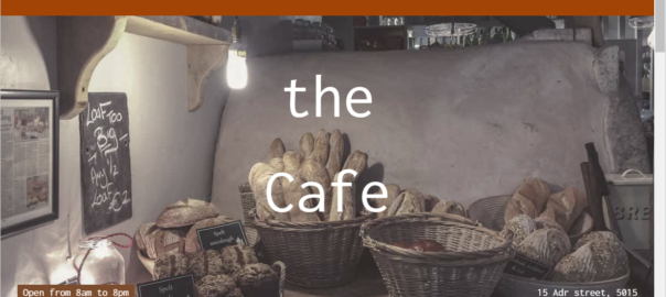
Look at the images below. Which one do you think looks the best? Why?

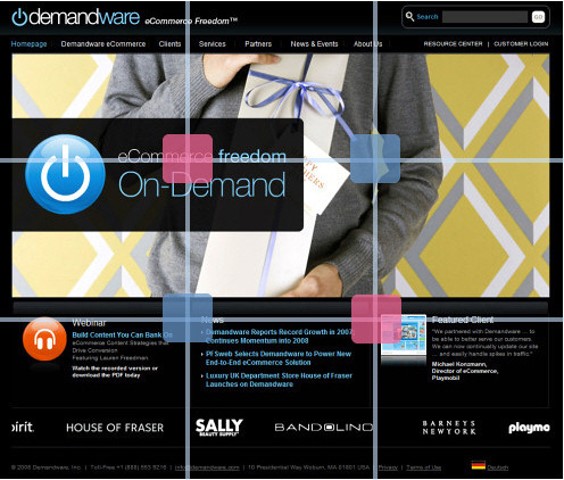
Now look again, with added sections, 3 rows and 3 columns:

(thanks to dolcepics.com)
When to compose an image, page, or layout, try to follow this “Rule of thirds” or “Divine proportion” (1.62).
Example for a webpage:
Articles:
- See Pinterest examples
- Understanding the rule of thirds in web design
- Design rules you should never break
Color
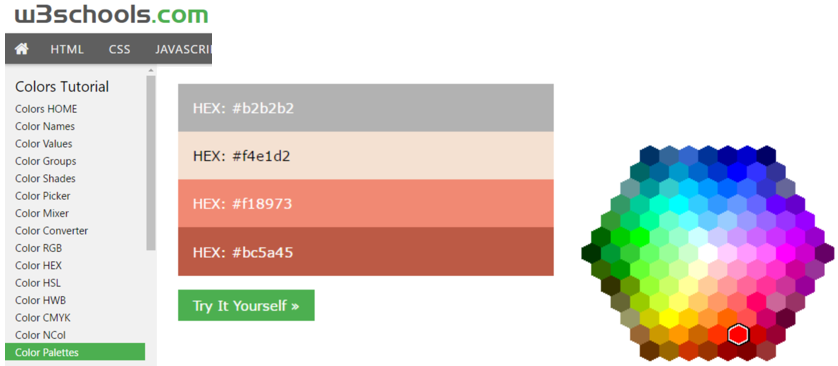
See w3schools color tutorial, use palette of matching sets of colors.
Use tools like the W3schools ColorPicker, ColorZilla (it has a color picker, gradient generator and more).
Design resources
Remember to:
Respect the rights of owners of media*
Check copyrights/license/terms of use of (stock) media*
* “Media”: texts, quotes, templates, scripts, plugins, fonts, photos, images, icons, pictures, animations, video’s…