Axure tutorial: prototype an ATM
This tutorial is written for Axure RP version 9. There might be slight differences with the current version (10).
For students, a permanent license can be obtained at axure.com/edu. The Java version of this tutorial can be found here.
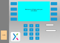
Axure is a tool to create interactive prototypes of for instance applications or websites. Check out docs.axure.com/getting-started-video to quickly learn how it works. We created as an example, a simple prototype of an ATM. The result, the interactive demo, is available here to try:
The focus of this tutorial is to achieve interaction, rather than design or ergonomics. No knowledge of Axure is required to follow this tutorial. This tutorial however does not cover all possibilities. On docs.axure.com/axure-rp/tutorials you can find a variety of tutorials. If anything is unclear in this tutorial, you can have a look at the end-result.
Start
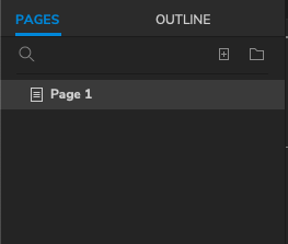 When Axure is started or when you create a new document, a homepage (Page 1) is created:
For this prototype, we will use Page 1 to prepare the Home page.
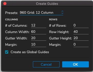
If you need some guidance when drawing shapes, you can turn on the grid: Choose View > Rulers, Grid and Guides > Show Grid . Alternatively you can use the shortcut cmd + ' or ctrl + '. In "Rulers, Grid and Guides" you will also find the grid settings. Through "Create Guides" you may set columns to help you with layout. Eg. choose a layout of 960 pixels wide by 12 columns.
You can remove these guides by choosing View > Rulers, Grid and Guides > Hide Grid .
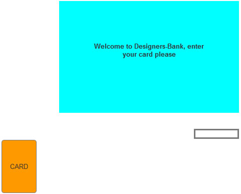
1. Create main display and welcome message
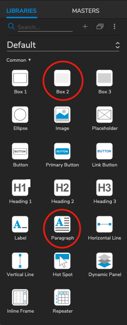 Select one of the boxes (in the list of widgets) -hold down the mouse button- and drag the box to the drawing area.
Place the box at the top, keep enough space for the number panel etc. which comes below it.
Trim the size if needed. Give it approximately the same size as the example below:
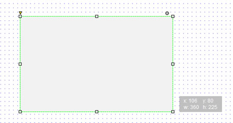
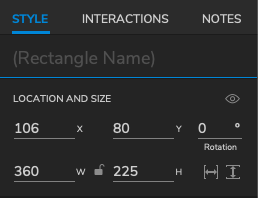
Alternatively, you can manually input the given size attributes in the sidebar.
Afterwards add a paragraph, and change the lorem ipsum text to "Welcome to Designers-Bank, enter your card please".
Adjust the font size, eg. Pt 18, and align the text: 'centered'.
This can be done in the sidebar under the header "typography".
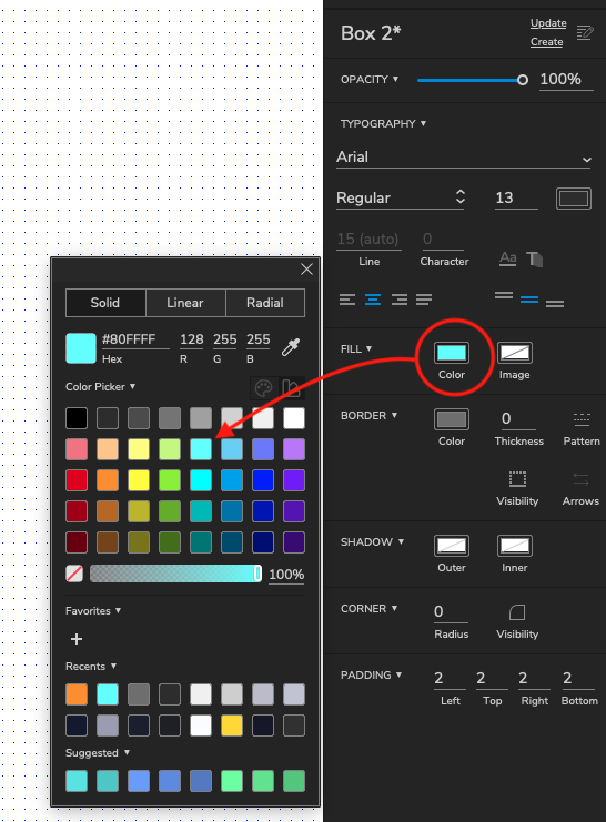
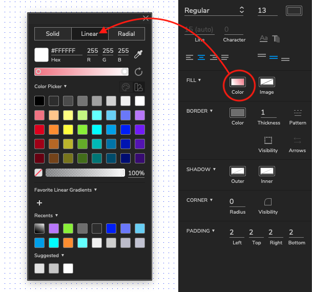
Give the box a light background color (use the Fill Color icon in the toolbar):
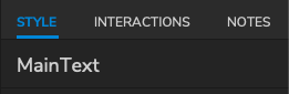
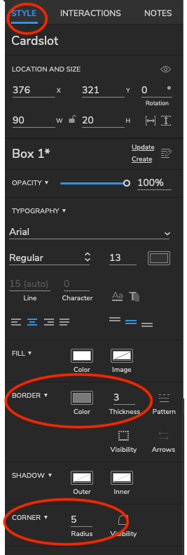
Finally, we set the name of the paragraph to "MainText": Make sure the box is selected. Type the name in the field under "Inspector Rectangle" on the right.
Save your work: click Save  . It is strongly advised to do this regularly.
2. Create and customize the card-slot and realize input of the card in the slot
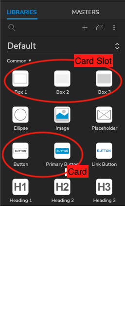
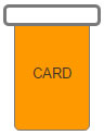
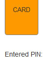
To draw the card we use a Button. For the card-slot we use a Box. Using the button tool, draw a card all the way to the left. Set the width to 70, change the background color (Fill Color) and set the text to "CARD".
Place the card slot right below the main display, set the width to 90 pixels, this is 20 pixels wider than the card.
Name the widgets "Card" and "Cardslot".
Style the card slot. In the Inspector (on the right) click "STYLE". At Border change the line thickness. Set the Corner Radius to 5.
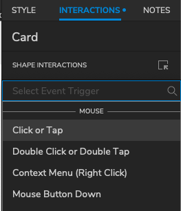
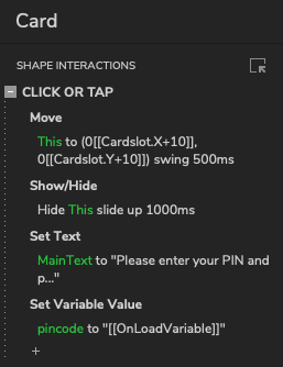
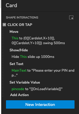
Now we make the card interact with the slot. Select the card. Under the Interaction tab click on New Interaction
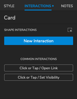
Now we select the type of interaction we want. In this case, we want something to happen if we click on the card, thus select: Click or Tap
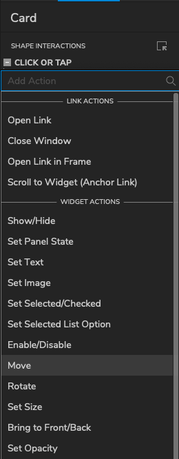
A new window appears. We want the card to move if we click on it, thus we select the action Move
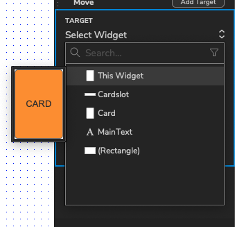
As we want the card to move, in the target tab we then select This Widget
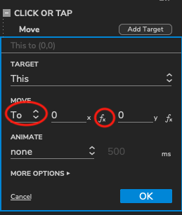
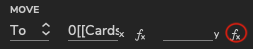
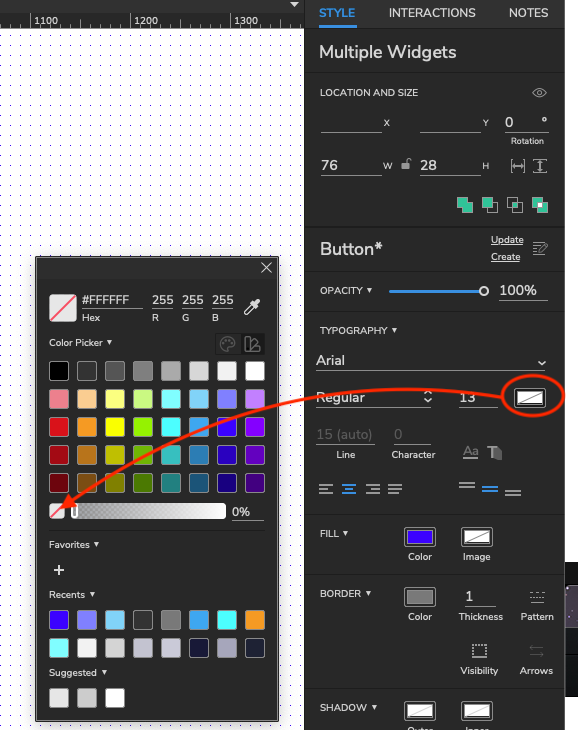
In order to ensure that the card moves towards the slot, we change the position, so it becomes the position of the slot. First set move to "to", then click on "fx" behind the x position at the bottom right of the screen.
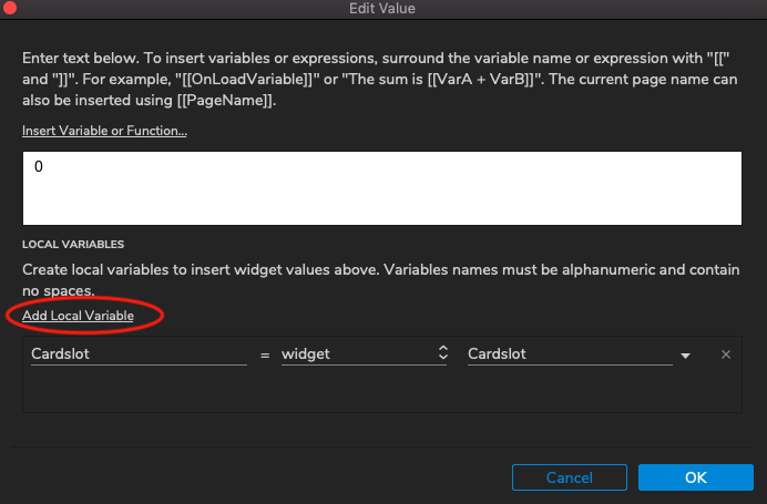
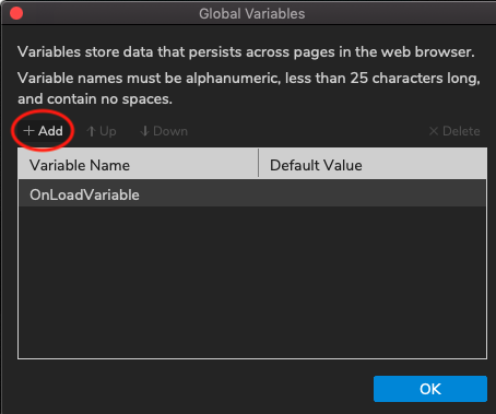
Local variables are variables that are only available in a widget or interaction. Global variables are available throughout all pages in the project and can be managed via Project > Global Variables...
Fx means that we will use a function to determine that position (X and Y). We need to use the position of the slot, and add that as a local variable. Click Add Local Variable, name it "Cardslot", choose "Widget" and then choose Cardslot:
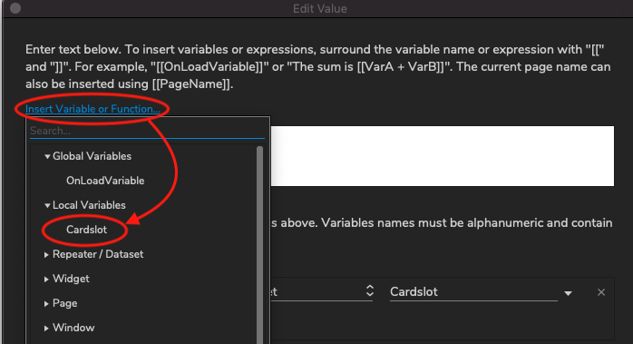
Now we can retrieve its position in the field above. If anything is there (eg. a 0), remove it. Click Insert Variable or Function and choose the Local Variable "Cardslot":
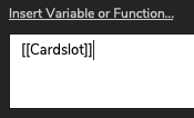
After this you see:
Change that to:
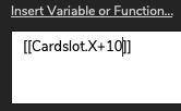
This makes the value equal to the x-position of the slot plus 10 (pixels). The card then moves to the middle of the slot ( (90-70) / 2).
Press OK to save the value. Repeat the same procedure for the y-position:
After you assigned a value for the y-position you can close the Case Editor.
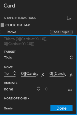
The programmed interaction for the Card should look like this:
If the Preview does not work, eg. if you get an error message from the browser, it is possible that a security application is blocking Axure. Check the security-settings of your browser and anti-virus programs. E.g. Add-ins like "Safe Surfing" / "Safe Surf" you can temporarily disable.
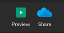 Now we can test it. Click the Preview icon in the upper right of the toolbar. The page should be displayed in a Web browser. If you click on the
card, it should move to the slot:
Now we can test it. Click the Preview icon in the upper right of the toolbar. The page should be displayed in a Web browser. If you click on the
card, it should move to the slot:
There are still a few details that need to be improved:
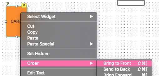
The card has to come to the front, so it looks like its in the slot. Right-click it and choose Order, Bring to Front:
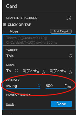
We want the card to move smoothly to the slot. We can achieve that by changing the animation style in the side panel to Swing at 500ms
Press Done. Save the document. Return to the preview in the browser and refresh the page (you do not need to click the Preview icon again: after a save, you can also refresh the browser to see the new version).
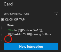
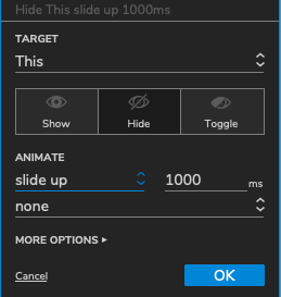
Next, we add a second animation which lets the card disappear into the slot. Make sure the card is selected and click on the plus under the move action. You will be able to add another action
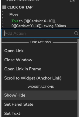
Select Show/Hide from the dropdown menu.
Afterwards select as target "This Widget", 'Hide' and a slide-up animation of 1000ms, like shown below:
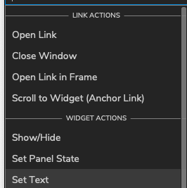
After having clicked ok, add a third action like you did previously. This action will change the text in the main display. To do this, select Set Text from the dropdown menu.
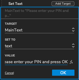
Assign it to (MainText) and change text to: "Please enter your PIN and press OK.". Your settings should look like the ones below:
Click OK and test the page in the browser.
If you want to edit your interactions, change their order and access more advanced options, you can do that by simply clicking on the icon next to "Shape Interactions" in the sidebar  . A new window with more options will pop up!
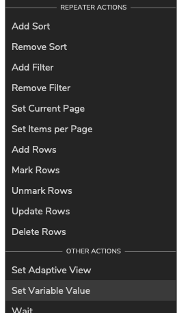
If the card begins to disappear while still moving toward the slot, you can add a 'Wait' of 500ms between the Move and Hide in your action list. (The Wait action can be added following the same steps as above, the action is located at the bottom of the dropdown menu under "Other Actions"). Note that you can change the order of the actions by simply dragging them in the preferred order.
Also, you might want to tweak the y-position the card moves to a little, it is now [[Cardslot.Y+10]] but [[Cardslot.Y+3]] might look better.
3. Input PIN code
* It is also possible to design the buttons first, then create one interaction and copy the interaction to other elements. See "Graphic design tips for Axure".
 The PIN will be entered with a numeric keypad, which we build with buttons (like the card we made previously). In order to do this effectively we first create one button, give it functionality and then copy it (including interaction) to create a keypad.
Start by creating one button in the canvas with the text "1". Design it as you think a numeric button should look like, name it "BtnPin".
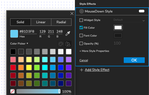
Because a button is an interactive element, you can set interaction styles. For example, to light up the button when it is pressed.
To set an interaction style, after you have selected the button, on the sidebar you will find style effects.
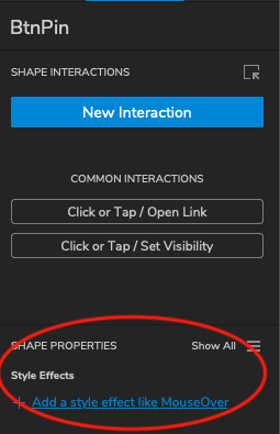
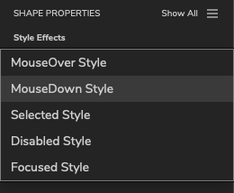
We will change the fill color of the button so that if it's being clicked on, the button becomes lighter. To do this, check the Fill Color box and change it to a lighter blue (or any other color). Feel free to add any other style effects as you wish.
Store the PIN code
Let's add a global variable that will store the value of the PIN entered. A global variable is a variable that is available everywhere, in all widgets and interactions.
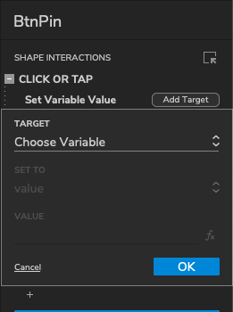
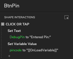
Select the button (BtnPin) and add a new "Click or Tap" Interaction as done before. From the dropdown menu select Set Variable Value
Select "Add Variable":
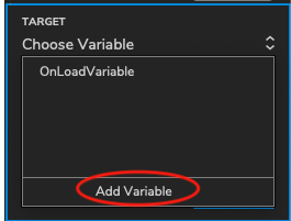
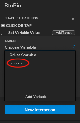
In the new window click "Add Variable".
Name the variable pincode and press OK
After having clicked OK you should see this on the sidebar:
We are going to do a trick - we are going to assign the value that is on the button to a variable. The value that is visible on the button (it is its label) is also the text of the widget. We use this in this way because we want to make copies of this button that will get a different label, yet keep the same interaction, with no need to reprogram it.
We click on "Choose Variable" and we select the previously made variable pincode.
Afterwards we want to set the pincode to a value. To do this we select set to value and then we determine the value by pressing on fx on the value input line.
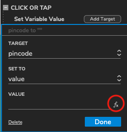
Firstly we create a local variable text . This local variable gets the value of the text on the button (in this case "1"). Now we press Insert Variable or Function and choose firsly the global variable pincode, then the local variable text
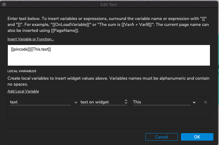
The value is now:
[[pincode]][[This.text]]
Press Ok (twice).
Test
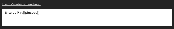
For testing, it might be useful to see what value is entered. We will use a label to display the value of the variable pincode. Place a label somewhere at the side, for example under the card. You will find Label together with the buttons and boxes on the left hand side of the interface.
Set its name to "DebugPIN" and set the text:
We now add a Set Text action under the Set Variable Value action like we have done before. We set the target to DebugPin, text and we press fx to add a value function.
Set the value to:
Finish by clicking OK twice and test the page in the browser. If it works well, each time you press the button the displayed value is incremented by one.
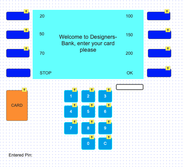
We can now copy the created button to create a numpad, add a proper layout and customize the labels of the buttons to the number that they are representing. It should look like this:
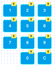
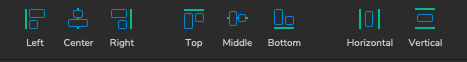
Tip: you can use, together with the grid and guidelines, the help tools found on the topbar in order to align your buttons!
Now test the page again. Is the PIN code displayed properly?
With what you have learned up till now, you can add a correction key "C" and its interaction, which erases the entered PIN. Note that this requires two actions: clear the variable pincode and set the label DebugPIN with the original text. This is what it should look like:
No PIN should be entered when the card is not yet inserted. Therefore, add the same actions to the interaction of the card so the pincode gets cleared after the card is inserted. This is what the card interactions should look like:
4. Check PIN
We first add an Cancel/Stop and an OK button at the bottom next to the main display. Use empty buttons and place labels next to them:
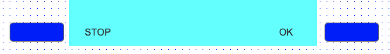
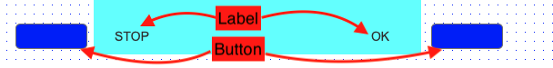
Name the left button: BtnScrn4 and the right button: BtnScrn8 (there will soon be more buttons above them). Name the labels respectively LblStop and LblOk. Consider also setting an Interaction Style to show that the button is pressed (MouseDown) like we did for the numpad.
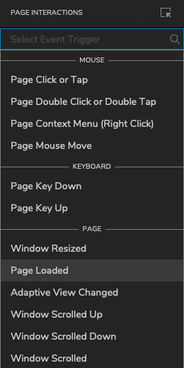
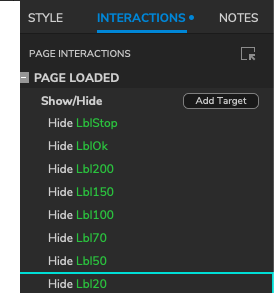
We make sure that the labels only become visible when prompted for a PIN. If nothing is selected in your Axure workspace, you will notice in the right side bar the option to add Page Interactions instead of Widget Interactions. If something is selected, just click on an empty spot in your canvas.
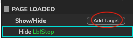
In this case we hide the labels when the page is loaded. So we click New Interactions > Page Loaded
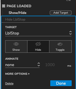
Then we select Show/Hide and we add as a target LblStop. Make sure that you select Hide. Your settings should look like this:
If you hover over Show/Hide, the option Add Target should appear. Add the button LblOk following the same procedure.
Now select the card. Add a Show/Hide interaction that shows both LblStop and LblOk like we did on the previous step. Your shape interactions should look like this:
Check the PIN
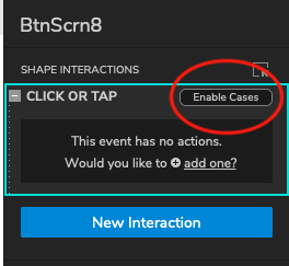
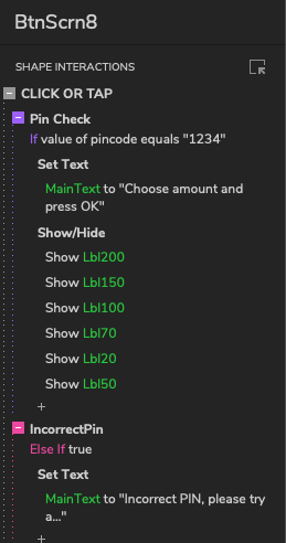
If the OK button is pressed, we will verify the PIN. Select the OK button (BtnScreen8) and create a new Click or Tapinteraction. After we have created it we click away as we do not want to add any actions. We want to enable cases. To do this we hover over click or tap and the button Enable Cases should appear. We click on it.
We will create a new case that will check if the pin typed in is the right pin. We name the case Pin Check, we click on Add Logic and we check if variable pincode equals "1234". For the demo, we use "1234" as a correct value for the PIN.
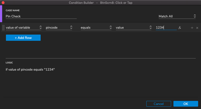
Press OK to close the Condition Builder.
The next action we add will only be executed if the condition is true (ie, if the PIN is the correct PIN).
This action is to offer a choice for the amount of money. For now, we only change the text displayed in "MainText". Further actions are explained in the next step.
We display the message "Choose amount and press OK". To do this we add a Set Text action and we set MainText to "Choose amount and press OK"
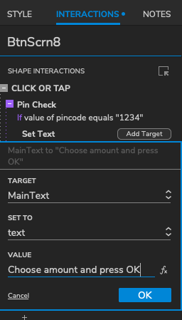
Click OK.
If the entered PIN was incorrect, we must respond with a message like "Incorrect PIN, please try again...". And the variable pincode must be cleared. For this we add a new case to the Ok button (Btnscreen8) by clicking "Add Case" like we did previously.
If the previous case was an if condition, Axure will automatically make this condition an "Else If True" Condition. Name it "IncorrectPIN" and click OK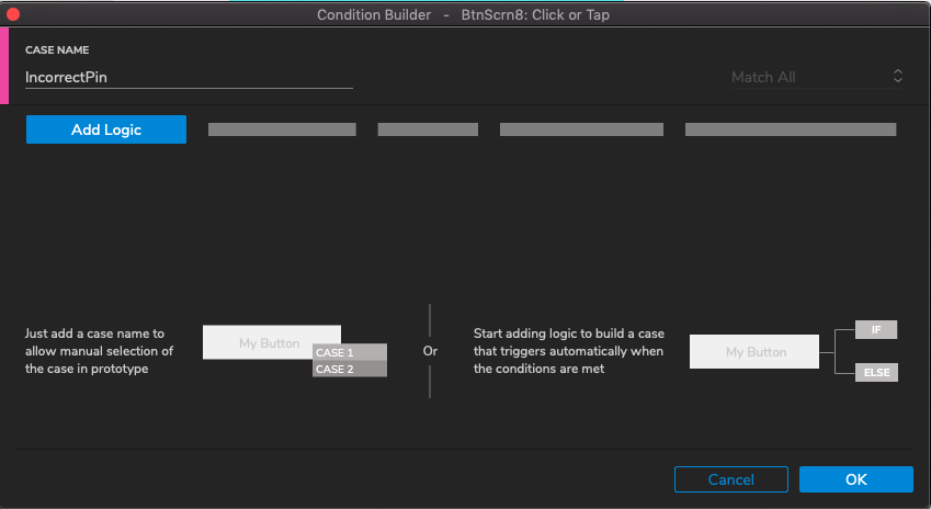
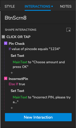
The condition "Else If True" means if the previous condition was not true, this action will be processed (as with if () ... else ... statement in Java). In this case "MainText" will display the message "Incorrect PIN, please try again...". And we make the variable pincode empty.
The complete interaction for the Ok button (BtnScreen8) now looks like this:
Don't forget to save and test the page before continuing.
* It is also possible to design the buttons first, then create one interaction and copy the interaction to other elements. Also design elements can be copied to other elements. This can be done using the Format Painter (CMD+m or CTRL+m).
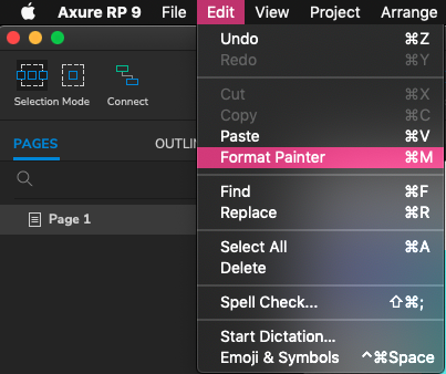 For more information see "Format Painter Styling Widget". There is also an older article explaining in depth the use of the format painter, it is however suited for Axure vs8: "Graphic design tips for Axure".
5. Select amount of money
So that we can actually select an amount of money to detract from the bank account, we need to add buttons that represent different amounts of money. Like we did for the numpad, we will create one button including functionality which we will then copy and paste the needed amount of times. In total we will have 6 "amount buttons" to be added to the "ok" and "stop". We start with the button for the amount "20":
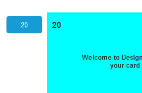
Name this BtnScrn1, with text "20". Next to it, add label "20". We will use the value again in a global variable. The text inside the button will be hidden later because (physical) buttons beside the screen have no text at a normal ATM.
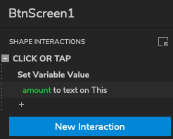
Select the button BtnScrn1 and add a new Interaction, select Click or Tap > Set Variable Value. Click Add variable to add a new global variable and name it "amount". Afterwards set the target to "amount", select "Text on Widget", select widget: "this". This is what it should look like:
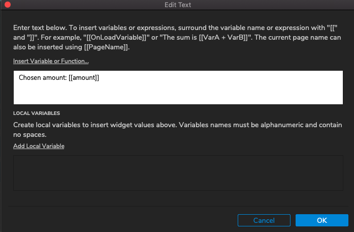
Now we add an action (+), Set Text > MainText and we click on fx next to value to add a function. The function should output the text "Chosen amount"+ the actual amount. To do this we type Chosen amount, then we add the previously created global variable "amount". The function box should look like this:
Now we can add the other buttons and labels, by copying them from BtnScrn1 and its label. We create 5 more buttons. Give each button corresponding amounts as the text. So the second button will be "50", the 3rd "70", etc. After that, make the button text invisible by slecting all six buttons and on the sidebar under text color select the empty color box.
Rename the new buttons on the left BtnScreen2 and 3, and on the right side BtnScreen5 - 7 . Also give all labels meaningful names, for example, the label "20" Lbl20 etc.
Now your button set up should like this:
Make sure all labels in the Page Interactions, are hidden. We do this like we did with the two other labels by clicking on Add Target and selecting each label. This is what it should look like:
At the Ok button (BtnScrn8) we have to ensure now that the labels of the amounts become visible again if a valid PIN was entered. Select the button and click on the + sign under the CheckPin case. Select Show/Hide and select Show for the labels Lbl20 - Lbl200:
Don't forget to test if the amount selected is displayed and save your file.
6. Eject note
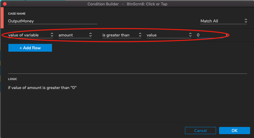
If you push the button OK, we have a problem, because the interactions linked to it are for entering the PIN. We can distinguish between these two stages in the process by looking at the variable amount: It has a value (greater than zero), then we are in the phase of output of the money. We will therefore after the PIN has been entered, set the variable amount to zero.
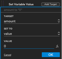
Select the OK button (BtnScrn8) and add to both the 'PIN check' case and the 'IncorrectPIN' case an action that sets the global variable amount to zero:
Now we can add a new case to the button that has the condition "If value amount > 0". If so, then we are in the stage to deliver the money.
Click Add Case (for OK button). Set the case as shown below. Press Add OK to set the condition.
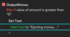
In the main display (MainText), show the message "Ejecting money ..." like we have done previously.
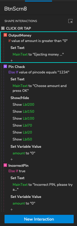
The order of Cases is wrong now. Drag the new case "OutputMoney" to the top of the list. (You may also use right-click, Move Case Up). The complete set of cases should look like:
If the order of If ... Else If .... Else If ... is different, you can right-click a case and select "Toggle IF / ELSE IF" to change it.
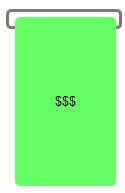 We will now create an animation of a note that comes out of the slot. Copy the cardslot and name it "EjectSlot". Make it a little wider. Draw a
new button in the slot and make it look like a banknote. Name it "BankNote".
We will now create an animation of a note that comes out of the slot. Copy the cardslot and name it "EjectSlot". Make it a little wider. Draw a
new button in the slot and make it look like a banknote. Name it "BankNote".
Hide the BankNote when the page is loaded. To do this add it to the list of the hidden elements togetner with the buttons in the page interactions.
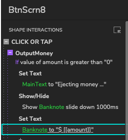
Select the OK button (BtnScrn8) and add a "Show/Hide" action under the Case "OutputMoney". Select Slide Down and 1000ms. This action will show the BankNote with a slide down animation of 1000ms. Add another action that shows the value of the chosen amount on the ticket. Use Set Text, with a value (via the button fx) of the global variable amount.
The actions for the case "OutputMoney" now look like this:
Try if it works.
7. Stop after note is ejected and enable abort
After the animation of the money is finished, the interface must return to its initial state. Select the OK button (BtnScrn8) and add a "Wait" action of 5000ms (5 seconds) under OutputMoney.
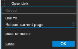
To return to the initial situation, we can return the page to its original state by doing a Reload of the page.
This can be done by adding an Open Link action under the previously added action, selecting Reload current page and clicking OK. It should look like this:
Check if it works.
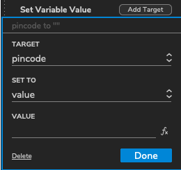
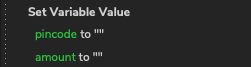
After a Reload, global variables still have their values. This may case undesirable results. To prevent this, give all global variables an initial value. We can do this in the page interaction under the "Loaded" tab. We add a new action called "Page Loaded". Under Page Loaded we add a new Set Variable action. We set both pincode and amount to empty. This is done by leaving the value field empty.
This will prevent some of the problems. But if you test carefully, you will see that it is still possible to press the OK button, and get the message that the PIN is incorrect or even withdraw money. We will solve these problems in the next step.
Until now we have done nothing with the Stop button on the left. A simple way to handle it is go back to the initial state. We just did this after the money was ejected. Now add the same action (Reload) to the Stop button: select the button (BtnScrn4) and add a new interaction: Click or Tap > Open Link > Reload Current Page.
8. Prevent unintended interactions
As we saw in the previous step, the user can click on buttons while this is not intended. We have already partially solved things by ensuring that variables have proper values when the page loads. But this will not prevent clicking widgets that should not be used yet. A solution is to make these widgets start disabled, and only enable them when they should be used.
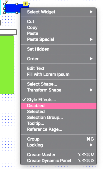
We do this for the Ok button (BtnScrn8): Check this box with the right mouse button and choose disabled:
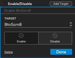
Then enable the button after entering the card: Select the card. Add Enable/Disable action, click Enable.
You can do the same for the other buttons.
9. Enhance the interface
To make the interface look more like one system, you could add a frame around it. We also add a logo.
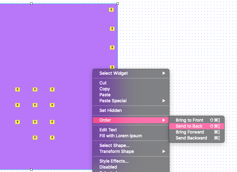
Draw a box around the entire interface and place it in the background using the right mouse button menu: Order, Send to Back:
Take care to adjust the layout of this framework by example background color, border and rounded corners.
For example, you can use a gradient as Fill Color as shown here:
You can find this via the Style properties on the right sidebar.
To add an image as the logo of the machine, drag an image in the editor. Double click it to add the file that contains the image. If asked if you want to use auto-size, choose Yes, then the image in its original size is put into the page. Choose No, the picture is scaled to fit the image-rectangle as drawn.
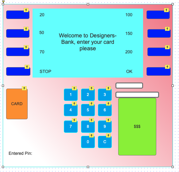
An example of the end result you can find below.
10. Export to HTML
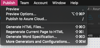 Via Publish, Generate HTML files you can store the created page as an HTML file. Then you can publish this for example on a website (you have
to upload the entire folder with generated files). This can be useful to offer the page as part of a usability test.
Via Publish, Generate HTML files you can store the created page as an HTML file. Then you can publish this for example on a website (you have
to upload the entire folder with generated files). This can be useful to offer the page as part of a usability test.
To view the page without the Axure-menu on the left, use the file home.html. If you want to view this page full screen, use the F11 button of the browser.
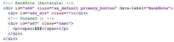
If you want to edit the HTML code you can easily find all the widgets in the HTML code, the names of the widgets can be found as a comment and have the HTML attribute data-label:
Downloads & more info
The result, the interactive demo created by this tutorial, is available here to try:
Download the resulting Axure-file: atm_tutorial_v9.rp (version 9), atm_tutorial.rp (version 8)